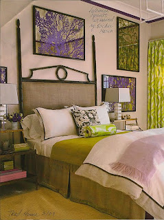
Manhattan interior designer Amanda Nesbit loves to use chartreuse in her designs. Here are some of her fabulous designs that might inspire you. So shake it up with chartreuse!
Monday, May 24, 2010
Tuesday, May 11, 2010
New Week, New Color, BIG Statement!
Chartreuse is a 50:50 mixture of bright green and yellow and the French liquor made by Cathusian monks give its name to the color.
Not many are daring enough to use chartreuse in a room. It's BIG color so you don't need much to make a BIG statement.
I think it's a great color when balanced with the right color combination. It can be combined with turquoise, pink and other vibrant colors to create a bright, cheerful ambiance. If you want to make a trend-setting statement, my recommendation is pairing it with grey, the biggest color forecasted for 2011.
Stay tuned for great ways to use chartreuse this week. It's going to be exciting!
Friday, May 7, 2010
Designer in Color - Jamie Drake's Lavendar Bedroom
Jamie Drake designed this soothing bedroom using lavender-toned grasscloth, Italian lanterns and luxurious fabrics.
The textured throw at the foot of the bed is Indian-inspired and its smaller scale pattern adds variation and interest to the tone-on-tone rectilinear pattern of the quilted spread. Jamie adds a larger scale pattern with the checkerboard Edelman leather rug.
Though the room is predominantly lavender, it's not over the top because he's added grey-tones with the art along with the light walnut stained wooden nightstand.
Photos courtesy: Traditional Home
Tuesday, May 4, 2010
Lovely Lavender
Lavender Color Box
I love the fresh scent of lavender and the natural beautiful of a field full of lavender. For this entry I let the aroma of lavender oil take over my mind, traveling back in time to a lavender farm in California's Russian River Valley. The smell and sight soothes the mind.
The use of lavender in a room can have the same effect. For a soft, wispy feel, add a misty-grey hue like you would see on a foggy morning. For a little contrast and interest, add touches a darker pansy-colored purple along with cool-toned white.
Now relax and enjoy your new lavender filled room. Don't forget the lavender oil infused candle or neck roll filled with dried lavender!
For more information about this Color Box, click here to contact me.
Saturday, May 1, 2010
South of Market Yellow
Here's a cheerful vignette at South of Market near ADAC West. It's a great example of using creamy white slip-covered seating mixed with daffodil yellow pillows, decorative spheres and art. The lighter toned natural wood gives contrast to the upholstery.
Subscribe to:
Posts (Atom)


